VERÓNICA ROMERO
VISUAL DESIGNER & WEBFLOW DEVELOPER
EXPERIENCE
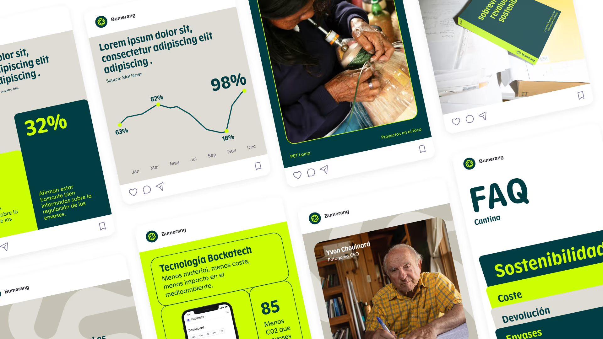
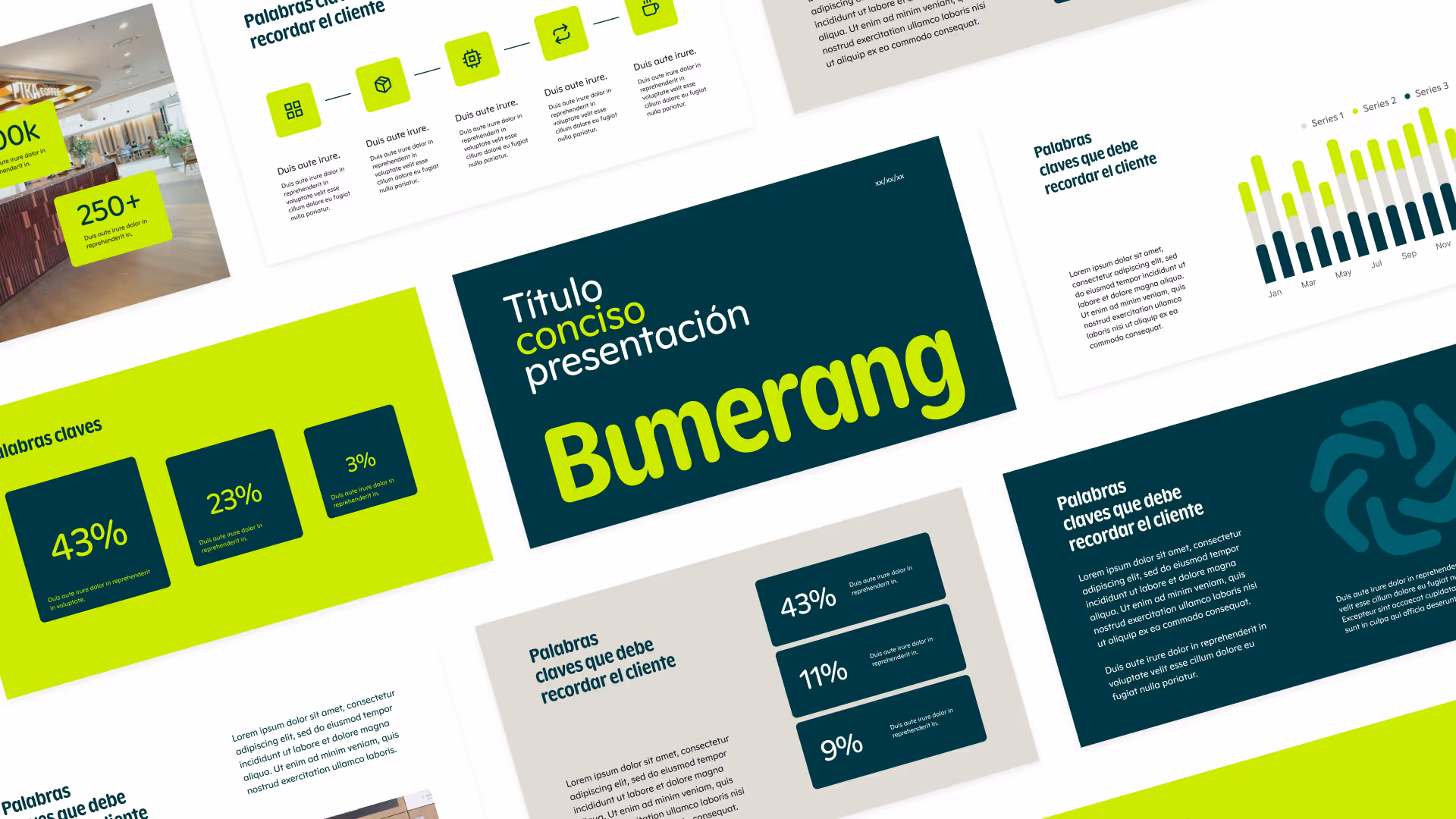
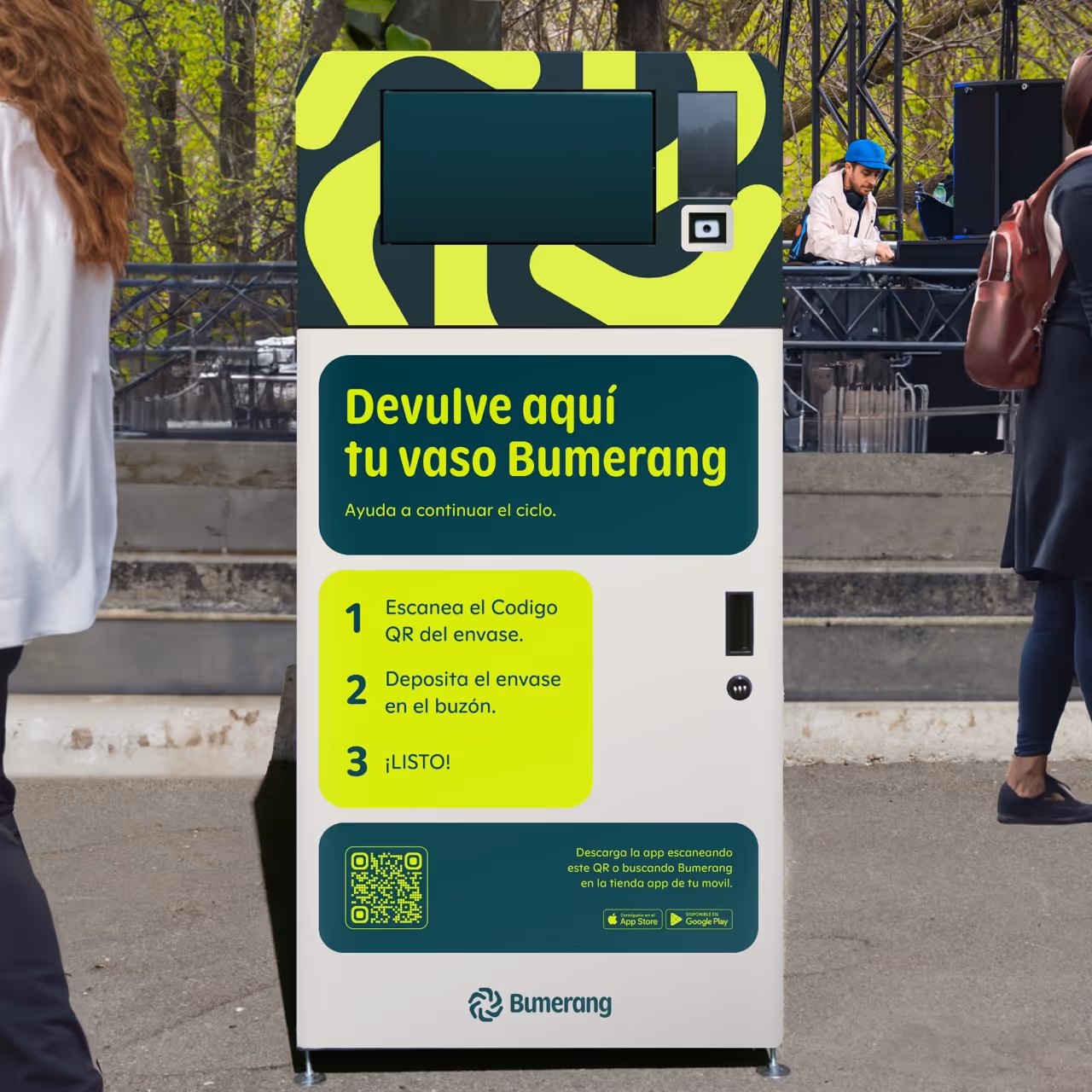
Refreshed the brand’s identity across web and marketing, provided UX strategy and copy, and supported post-launch. Built a bilingual Webflow marketing site with custom features (language switcher, locale redirects synchronised scrolling, ready SEO and GEO).
Without marketing spend, achieved over 90% user acquisition from social and organic channels, and demonstrated a strong long-term user return rate, peaking at 40%.
Check the live website here.
Started as a social media intern, building community engagement with instagram views over 300k. Transitioned into a design role, producing marketing visuals across digital and print.
Later, I led a brand refresh and Webflow website redesign, clarifying their SaaS value proposition and improving UX. Built a design system applied across product UI and marketing. Produced digital and print campaign assets to support growth.
The redesign enhanced user clarity and trust, made sales calls more efficient, and positively impacted user retention.
Check the live website here.
Designed conversion-focused landing pages for product campaigns and created event visuals and newsletters aligned with the brand. Increased customer engagement through optimised email and social designs.
The CCH needed a new branding, they wanted something fun, that inspired adults to feel like a kid again. The concept of a treehouse was very important for the owners.
The result? A new logo, visual identity, and promotional materials across web, social, and print that looked and felt like it were hand made by a little kid. Colorful, simple and fun. Designed a web prototype to improved navigation and conversions.
Produced TikTok promotional videos for new collections, delivering dynamic youth-focused content under tight deadlines.
Came up with creative concepts for CUPRA campaigns in partnership with FC Barcelona. Coordinated with cross-functional teams to execute social media campaigns that boosted visibility and engagement.
ABOUT ME
Hey, I’m Verónica, a maker of strategy-driven visuals, shaping brand narratives at the intersection of UI, marketing, and strategy for tech companies.
My background in advertising gave me a strong foundation for compelling concepts and honed my eye for memorable visuals and brand consistency, which I now bring to every project. I thrive on open collaboration while taking full ownership of my work.
Outside of my professional life, you’ll usually find me traveling, soaking up the energy of live salsa bands, or brainstorming fun ideas to bring to life.
JUST FUN
Built in a single day with the help of AI. A small tool for web designers that checks height, width, whitespace, visual weight, and bounding box quirks, then fixes it in one click, giving you a visually balanced logo carousel.
My first build. Perfect? No. Fun? Absolutely.
Try it here.
B2B brand design is going through it’s “dream sequence” (check Intercom hero example) era, taking traditionally buttoned-up industries and making them unexpectedly magnetic. Tech brands are leading the way, but why not bring that energy to other sectors? I designed a concept for a Spanish law firm website. The illustration doesn’t go full dream sequence (ran out of AI credits 😅), but the vibe still lands.
It’s a fresh visual direction for industries like law that have been overlooked for too long. Maybe we can call it: Postcorporate optimism.
I created a concept video for Coca-Cola titled “La magia de la primera vez, una y mil veces”. The idea explores the magic of experiencing something for the first time, whether it’s a taste, a moment, or a shared experience, and how that feeling can be relived over and over.
I focused on storytelling, pacing, and visual composition to capture the emotion and joy associated with Coca-Cola, carefully sourced visuals to ensure the right fit for the story, while selecting music and a voiceover to complement the written copy. This project was an exercise in concept development, visual storytelling, and translating a brand message into a short-form video experience.
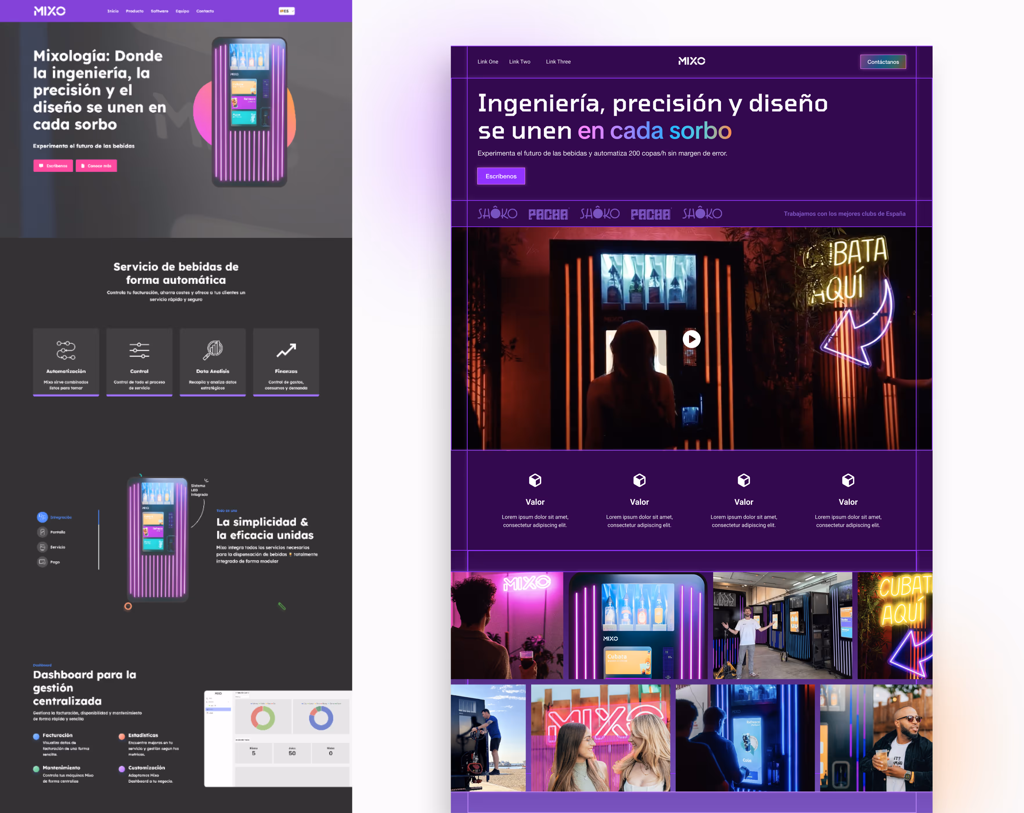
Sometimes small design tweaks can completely shift how a brand feels. I took a real brand and reworked their landing page.
Before:
- Overcrowded hero.
- Background video barely visible.
- No clear benefit upfront.
After:
- Clear headline and subheading communicating real value.
- Big, immersive video.
- Neon lines for personality.
- Trust logos featured early.
- Second section focused on value, not features.
- Real photos showing both the product and happy users creating a brand world before going deeper into features.
A few thoughtful changes can make a homepage feel more trustworthy, focused, and memorable.
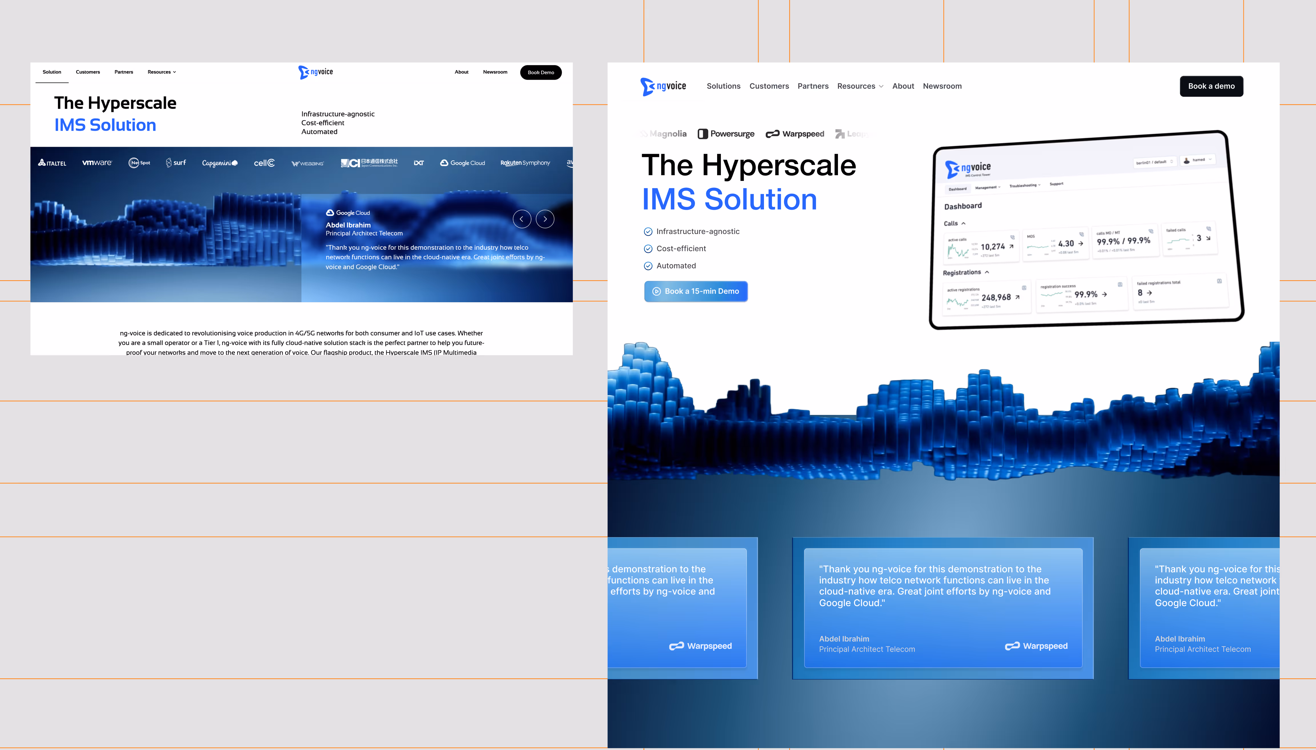
For this NG Voice website redesign practice, I focused on clarity, hierarchy, and user understanding. The hero highlights the headline, three key benefits, and a bold CTA. Testimonials moved into cards below the hero for social proof without distraction. A product mockup adds tangible understanding, and client logos were repositioned to maintain credibility.
Brand consistency and visual cohesion were preserved throughout, with inspiration drawn from company videos to enhance the testimonial and CTA sections visuals.
CONTACT